
ACCORD Hospice
A Paisley institution, refreshed for the next 30 years.
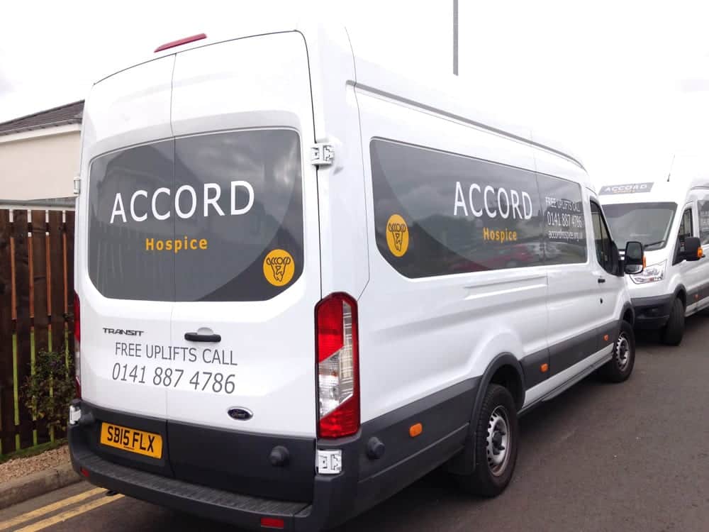
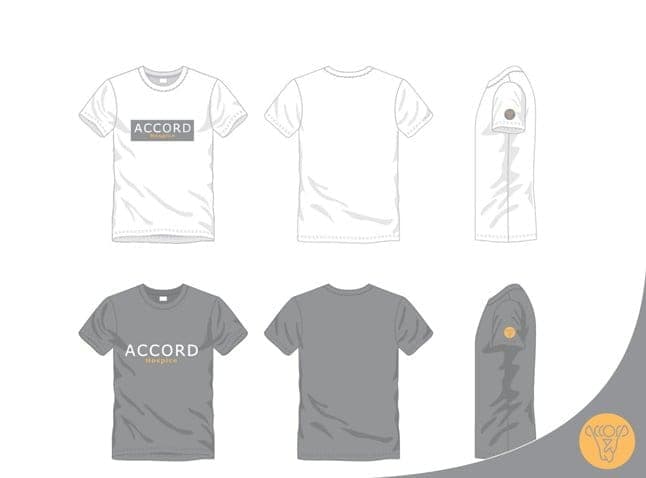
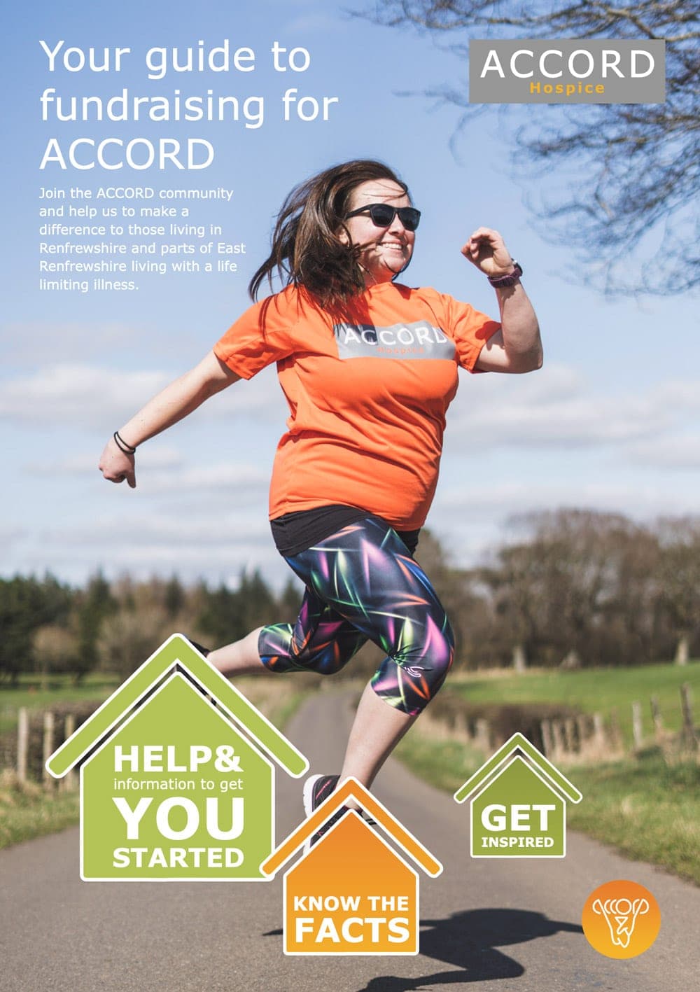
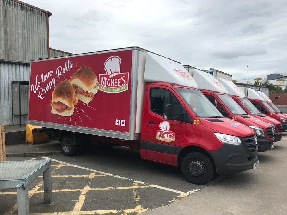
A complete rebrand for Renfrewshire’s hospice, developed with staff over two years and rolled out across 30 shops, 12 vans and the hospice itself.
ACCORD Hospice provides palliative and end of life care to people living with or affected by a life-limiting illness in Renfrewshire and parts of East Renfrewshire. Its compassionate approach supports patients and their families in the community, at home and in the hospice.
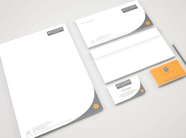
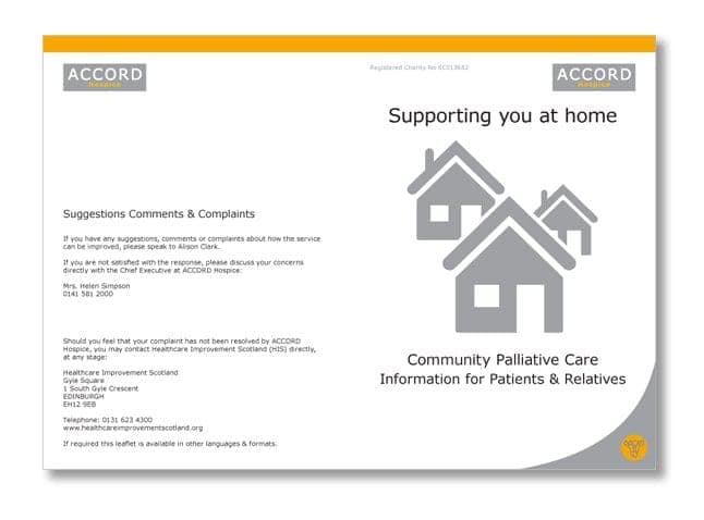
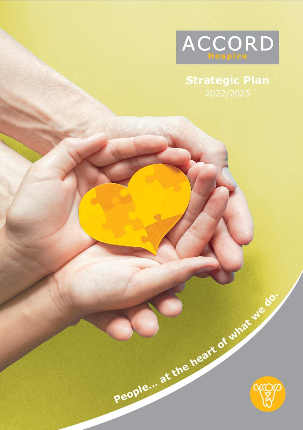
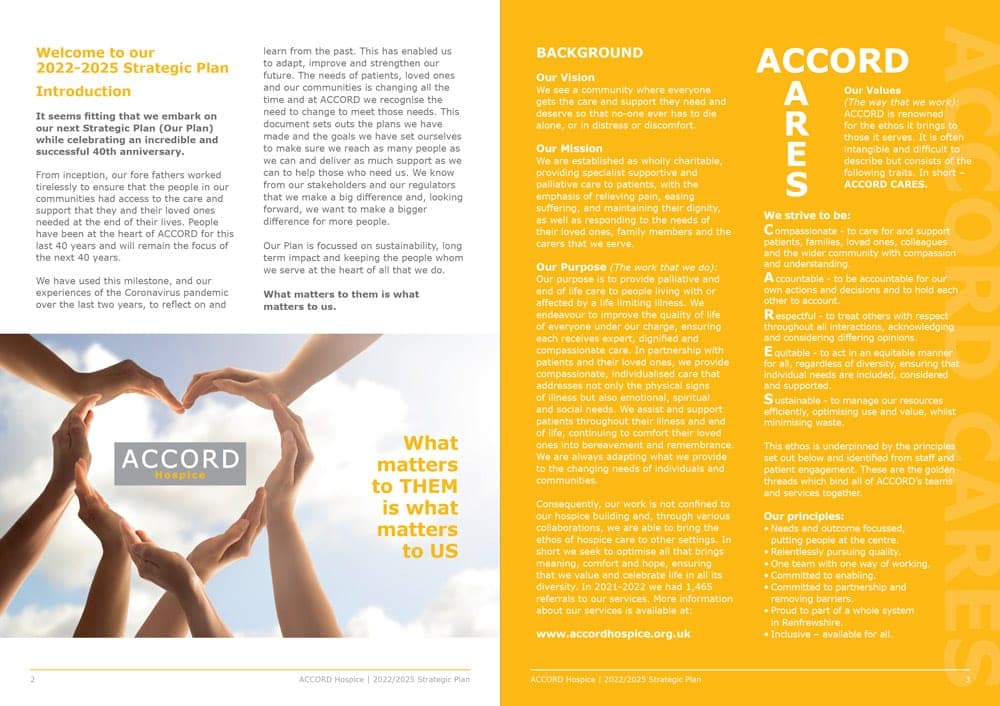
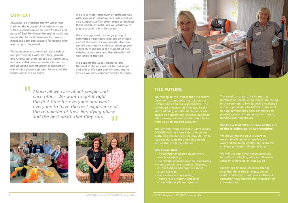
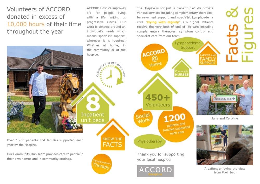
CO2 and the hospice staff developed the new ACCORD brand together, and it was put in place as the older branding needed replacing: stationery, vans, shop fronts, newsletters, badges and more. More recently we designed ACCORD Hospice’s Strategic Plan 2022/25 brochure. In a world where so much information is read on screen, it’s always nice to work with paper and ink!
Challenge, approach, result.
The challenge
The original ACCORD brand had been in use for over three decades and was part of Paisley life. Any change had to win over a board, staff, volunteers and supporters, and then work across the hospice building, a chain of charity shops, a fleet of vans and every leaflet, badge and collecting can. As a charity, ACCORD also needed the change to be affordable.
Our approach
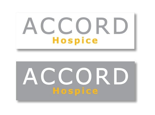
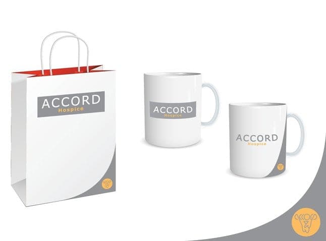
We worked alongside the hospice from board meetings to focus groups, listening to everyone’s opinion before recommending a direction. To keep costs down we designed the brand to be modular and easy to maintain: every part, from the logo to the signage, can be replaced on its own, so the new identity was rolled out as older items needed replacing rather than all at once.
The result
From first ideas to implementation took more than two years. The new brand was then rolled out across 30 stores, 12 vans and many other items, as well as the hospice itself, giving a classic Paisley brand a modern look built to last for decades. We continue to work with ACCORD, most recently on its Strategic Plan 2022/25.
- charity shops rebranded
- 30
- vans in new livery
- 12
- from first ideas to roll-out
- 2+ yrs
- age of the brand we replaced
- 30+ yrs
Drag to compare.
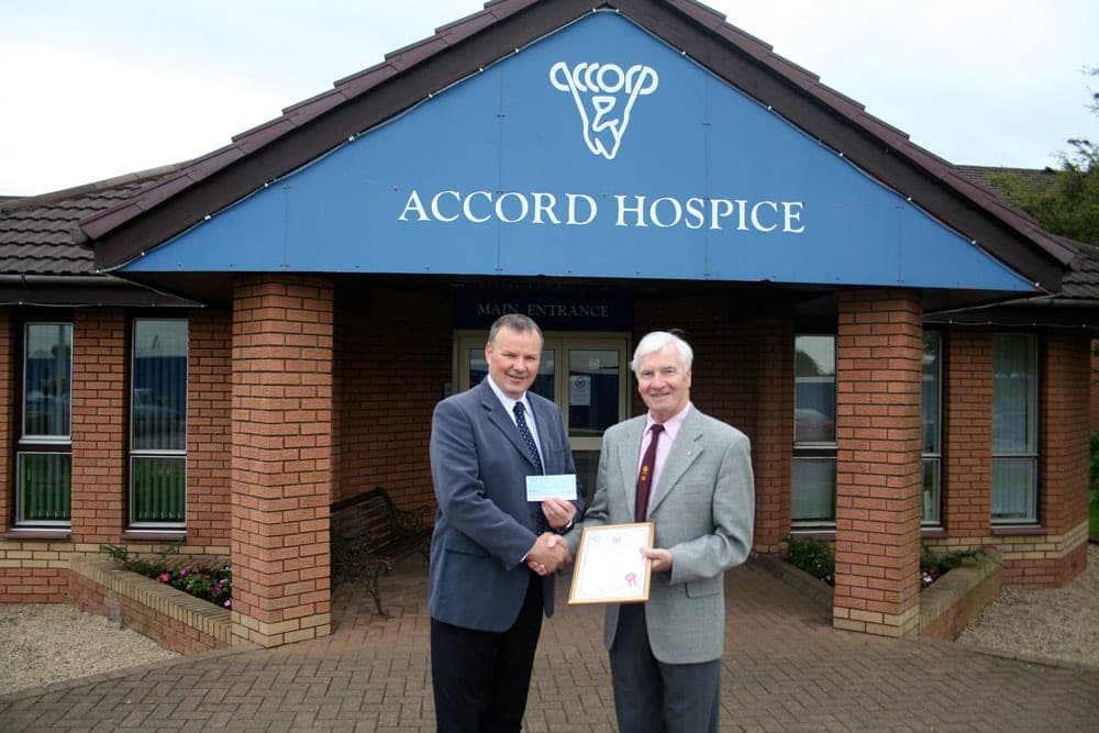
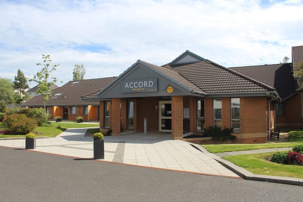
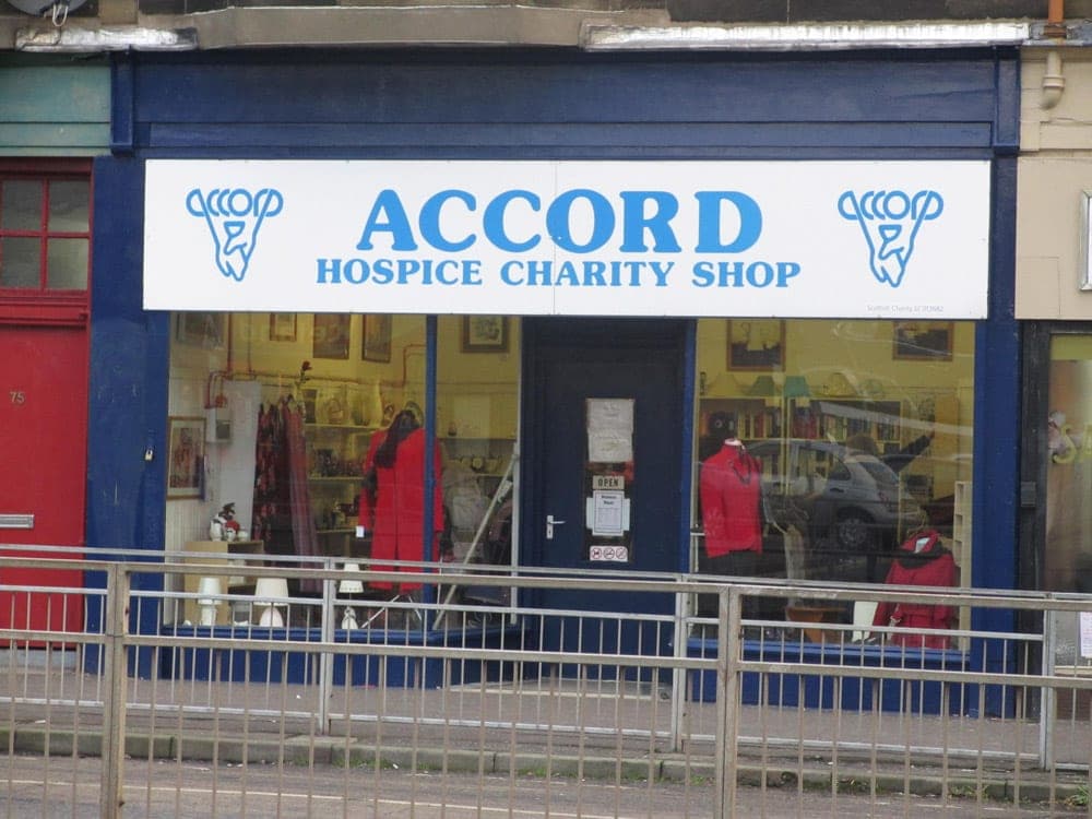
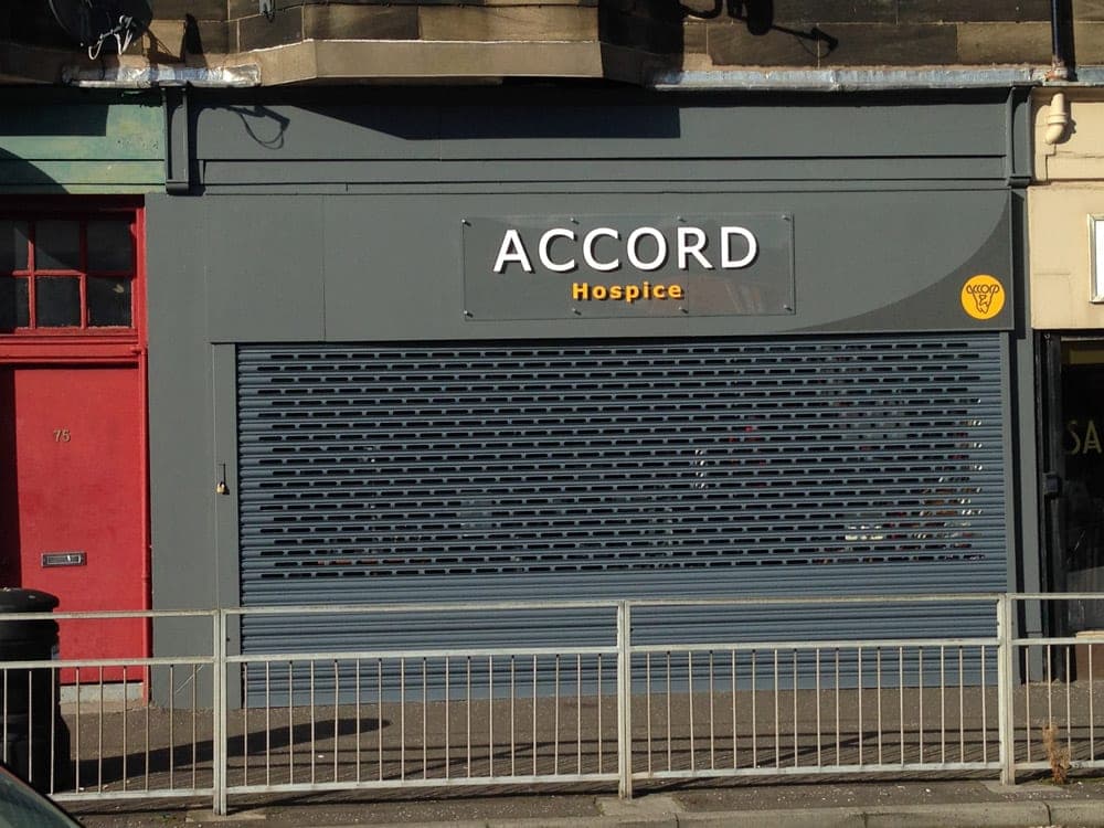
It was a pleasure and a delight to work on the rebranding of the Accord Hospice with CO2 Design. Not an easy project, it took more than two years to get from the initial ideas to implementation, then it had to be rolled out across 30 stores, 12 vans and many other items, not to mention the Hospice itself! CO2 stuck with us all the way from board meetings to focus groups, listened to everyone’s opinion, gave advice and came up with what we think is a fantastic new image.
More from the project.
Got a project in mind? Let’s talk.
Tell us which materials you need and we’ll come back with a free estimate. Or call and speak to a person.