Rebranding a charity: lessons from ACCORD Hospice
Rebranding a much-loved charity is about people as much as design. Here’s what we learned rolling out a new brand across a hospice, 30 shops and 12 vans.
A charity’s brand belongs to a lot of people: staff, volunteers, trustees, supporters and the families it cares for. When ACCORD Hospice in Paisley asked us to help modernise a brand that had been in use for over three decades, we knew the design would only be half the job.
Bring everyone along
The project took more than two years from first ideas to implementation. That wasn’t time wasted: we were involved from board meetings to focus groups, listening to everyone’s opinion and giving advice. A brand that people have helped shape is a brand they’ll defend.
Design for the budget you have
Charities can’t throw away a warehouse of leaflets or repaint every shop in a week. We designed the ACCORD brand to be modular and easy to maintain, so each part could be replaced on its own as older items needed renewing. The new identity spread across the organisation naturally, without waste.
Test it where it lives
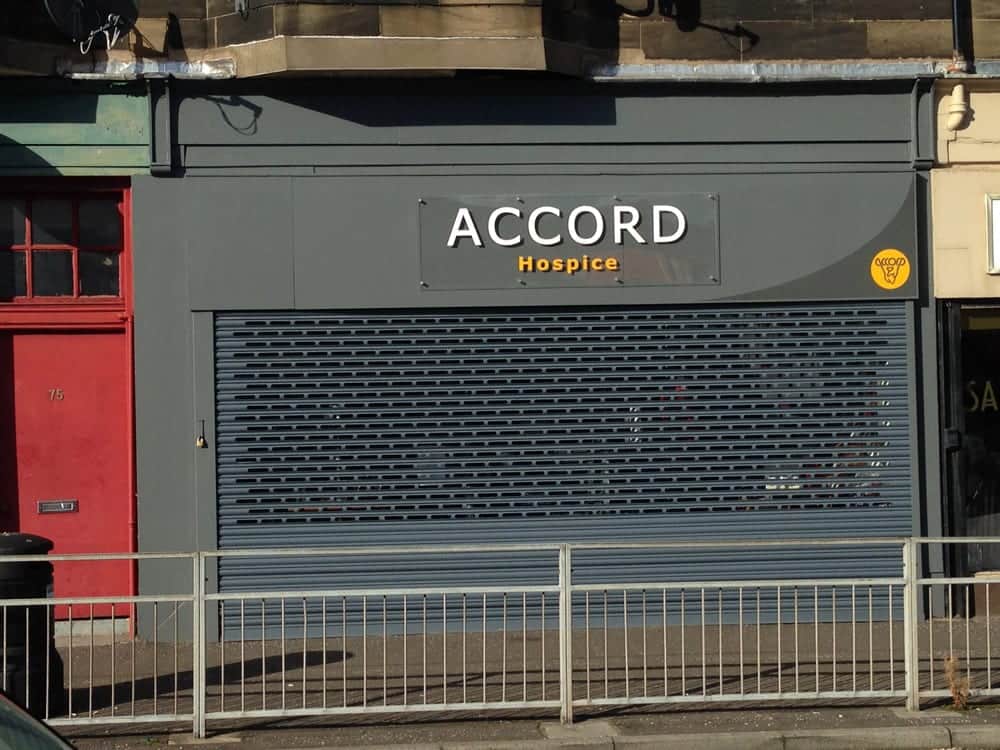
A charity brand has to work on a hospice building, a high-street shop fascia, the side of a van, a collecting can and a lapel badge. We checked every idea against those real uses before anything was signed off.
Keep going after launch
The ACCORD brand now runs across 30 stores, 12 vans and the hospice itself, and we still work with the team, most recently on its Strategic Plan 2022/25. A rebrand isn’t a one-off event; it’s the start of a long relationship.
Read the full ACCORD Hospice case study, or see how we help charities and community groups.